Have improvements in carbon intensity stopped?
The carbon intensity is a useful indicator, but also fraught with difficulties. Depending on the data choices, the policy implications could be quite different.

How is the US and other economies developing in terms of carbon intensity? The author discusses different approaches.
A rather simple question over Twitter “Is this really the case?“, could have taken 1 minute to answer. Instead, I wrote a blog!
The question referred to the trends in the carbon intensity (the amount of CO2 emitted per unit gross domestic product, CO2/GDP). Since 2000, according to one dataset, there has been no improvements in the carbon intensity.
Global carbon efficiency has been getting worse, not better. So far the 21st century has seen zero progress on this front. Not even relative decoupling has been achieved. Here again, "green growth" proves to be an illusion. #degrowth #postgrowth pic.twitter.com/XSMJCqxXQZ
— Jason Hickel (@jasonhickel) 2. januar 2018
In the Global Carbon Budget, we get something a little different, and the difference is due to the choice of GDP data.
The following figure shows the carbon intensity using the same carbon dioxide data, but with GDP measured in Market Exchange Rates (MER) and Purchasing Power Parity (PPP). Since 2000, these two datasets give very different trends, though the declines are still lower over the period 2000 to 2010.


How to measure GDP?
To understand the difference between the two curves, one needs to understand different ways that GDP can be measured.
How do these two measures of GDP differ?
- The Market Exchange Rates (MER) reflect the market value of different currencies,
- The Purchasing Power Parity (PPP) is the exchange “rate at which the currency of one country would have to be converted into that of another country to buy the same amount of goods and services in each country”.
The most famous version of the PPP is perhaps The Economist’s Big Mac Index, “the average price of a Big Mac in America in July 2017 was $5.30; in China it was only $2.92 at market exchange rates”. The PPP adjusts the exchange rates so that, in effect, the Big Mac would cost the same.
Many argue that the PPP is a better way to compare the economies of different countries, though there are issues. Exchange rates have also been a big debate in IPCC scenarios, but it may not matter. Either way, opinions are strong, and MER versus PPP discussions are a good way to get a black eye!
Within MER and PPP, I could make different data choices, but I have used the IEA data for consistency. For MER there is little variation between datasets, and for PPP, there are very few datasets to choose from! All data is in constant prices, as it makes no sense to compare over time in current prices.
Has the carbon intensity stopped declining?
The above figure shows that up until 2000 the carbon intensity in MER and PPP declined at similar rates. After 2000, the carbon intensity measured in PPP continued to decline while in MER it stabilised. The difference is not insignificant, one could infer different policy implications.
The question is why do they differ? Obviously, because the CO2 data is the same in both measures, the difference is due to the differences in the GDP data measured in MER and PPP. But, this needs to be explored in more detail.
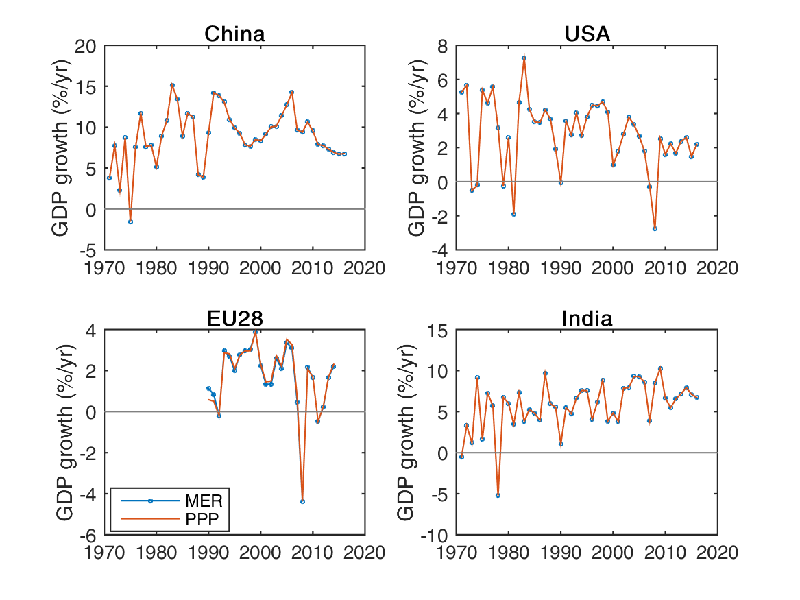
The following figure shows the MER and PPP data for the top-4 emitters of carbon dioxide. By definition, in the US GDP is the same in both cases. There is very little change in the EU, and each EU country will have a different PPP measure. Generally, GDP in MER and PPP are very similar in developed countries.
The differences are striking in developing countries, such as China and India. The PPP data is higher, but does it have a higher growth rate? A quick look at the figure would imply yes, but one needs to check the data as visuals can trick the eye!

The following figure shows the GDP growth rates for the top-4 emitters of carbon dioxide. I suspect many are surprised by this. The growth rates are the same in both measures of GDP, in MER and PPP. The PPP adjustment changes the GDP level, but not the GDP growth rate. In effect, the PPP/MER ratio is constant in each country.
I am not sure whether the PPP/MER ratio is constant in reality, or an artefact of the difficulties in measuring PPPs over time. One would expect that the PPP/MER ratios would change over time, particularly as a country develops. Though, apparently the Penn World Tables have varying PPP/MER ratios.
Carbon intensity at the country level
The fact that MER and PPP have the same growth rates at the country level is particularly relevant for analysis of trends in the carbon intensity.
The carbon intensity level will vary depending on the choice between MER and PPP (see figure below), but the growth rate will not. For China, the emission intensity is about twice the value in MER terms (see the ‘Big Mac Index’ above), making China look much worse in comparison to other countries. India goes from a bad carbon intensity in MER terms, to become better than the USA in PPP terms!
The MER and PPP choice only matters for country comparisons, but for climate mitigation, the level is not as important as the rate that the carbon intensity decreases.
If the carbon intensity declines faster than the GDP, then emissions go down. However, the carbon intensity growth rates are unaffected by the choice of PPP and MER (see following figure, bottom panels). Despite all the huff on PPPs, at the country level, it doesn’t matter if you chose PPP, MER, national currencies, or US dollars. These factors only matter when comparing countries.
The take-away message is to be very careful when comparing countries when GDP is involved. Make sure to know how it is measured, and don’t over interpret comparisons as they depend on the data chosen. And for mitigation policy, you don’t need to compare carbon intensity across countries.
Note that the growth rate of the carbon intensity is quite noisy, as it is the difference of two uncertain numbers (GDP and CO2 growth rates). This is why we smoothed the data in an earlier study.

Global carbon intensity trends
Decomposing emission intensities is hard, primarily since they are a ratio of two numbers.
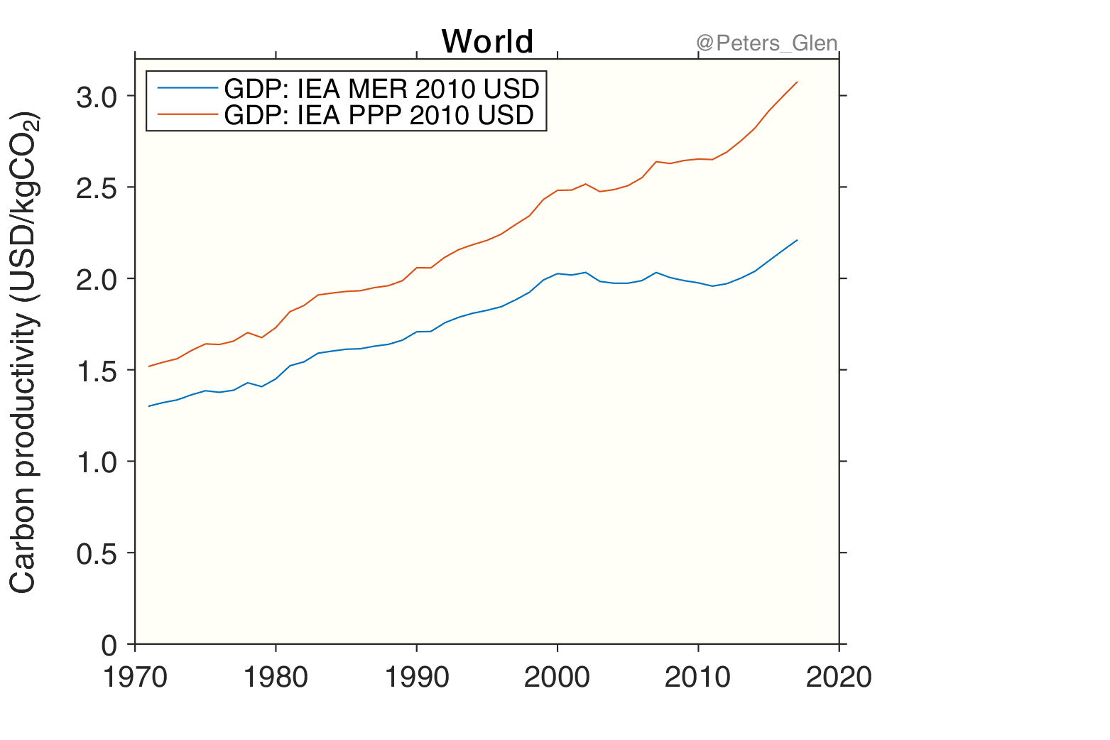
In our case, we use the same carbon dioxide emissions, but different GDP datasets. It is easier to explain why the carbon intensity levels out in the MER dataset by looking at the carbon productivity, the inverse of the carbon intensity. The carbon productivity is a measure of how much GDP is generated for each kilogram of carbon dioxide emitted.
The following figure (carbon productivity) is the same as the initial figure (carbon intensity), except that the data is inversed.
In the carbon productivity, GDP/CO2, the GDP becomes the numerator, making decomposition much easier.
If I take the difference between the carbon productivity using PPP and MER, it can be decomposed into the difference between the GDP using PPP and MER.
Int(PPP) – Int(MER) = GDP(PPP)/CO2 – GDP(MER)/CO2 = (GDP(PPP) – GDP(MER))/CO2
I am sure this difference has no physical interpretation, other than a nice mathematical tool to show that the difference is driven by the PPP measure of GDP in developing countries.
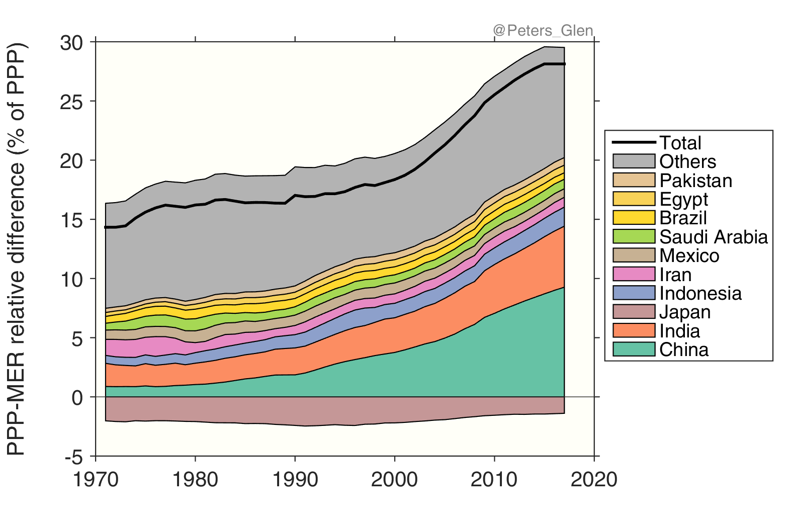
The following figure shows the difference between GDP measured in PPP and MER terms, as a percent of the GDP measured in PPP. As expected, the differences are dominated by developing countries, all of which make the GDP bigger in PPP terms. The relative difference also changes more rapidly from about 2000, which explains why the carbon intensity (and productivity) level out in the MER dataset after 2000, but not in the PPP dataset.
A Kaya decomposition
Does it matter if carbon intensity is measured in PPP or MER terms?
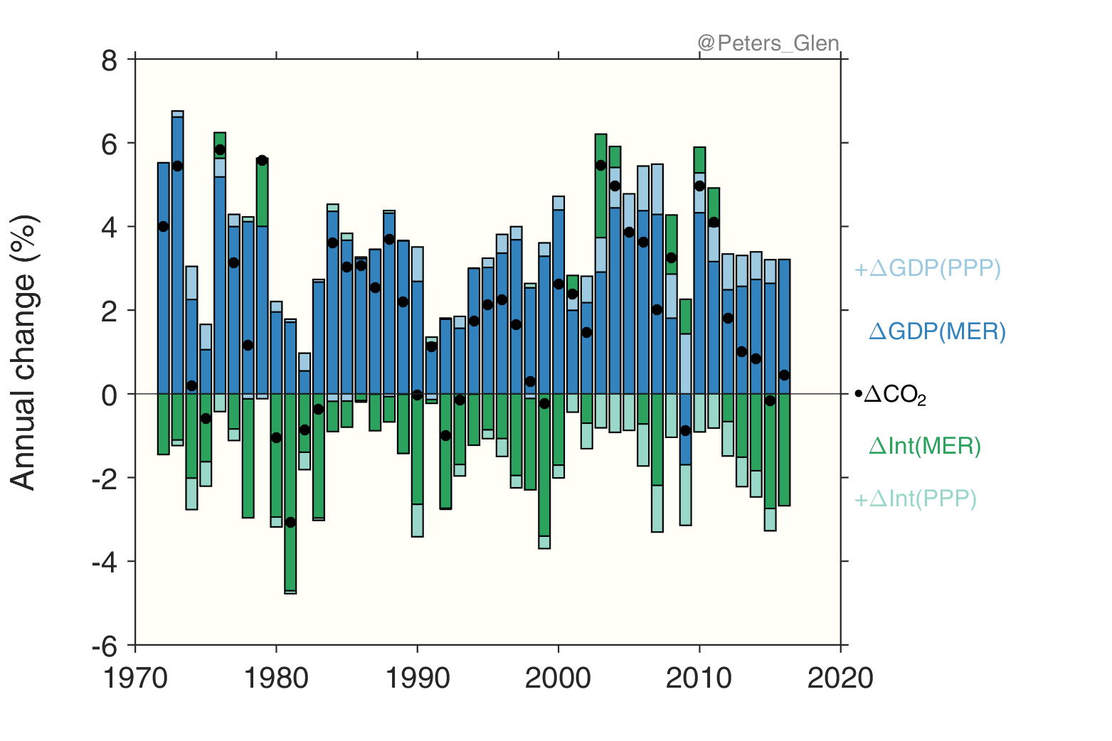
One way to see that is to compare a Kaya decomposition, a breakdown of CO2 emissions into components of GDP and carbon intensity, using PPP and MER. The general equation for a Kaya decomposition is
CO2=GDP*Int, where is the carbon intensity is Int = CO2/GDP
Or in terms of growth rates
ΔCO2 = ΔGDP + ΔIntensity + ΔInteractions
The interactions between terms are small, and not included here.
The following figure, though complex, shows that it doesn’t matter if you use GDP in PPP or MER terms, all that matters is that you are consistent. The dark colours (blue and green) are the Kaya components using MER terms, while the light colours (blue and green) are the additional growth from using PPP (add the dark and light colours to get the PPP totals). In all cases, the change in CO2emissions is the same: make the GDP higher, then the carbon intensity is lower.
What does this mean? If you use PPP, the carbon intensity declines faster, but the GDP growth rate is higher. If you use MER, the carbon intensity declines slower, but the GDP growth rate is lower.
Back to the original figure (and tweet), yes, the carbon intensity in MER terms has had a lower growth rate, but the GDP growth rate is also lower in MER terms. If you chose to use carbon intensity in MER terms, then you also need to use the GDP in MER terms. They are matching pairs.
A simple answer?
The original question, “is this really the case” that declines in global carbon intensity have stopped is really easy to answer.
- Yes: If you use Market Exchange Rates (MER)
- No: If you use Purchasing Power Parity (PPP), since PPP weights developing countries more
What to use? There is no perfect answer, as it depends on what you want to show.
At the country level, PPP or MER, the results are identical. This is a key point. It is better to look at country level trends where policies matter and are implemented.
The global carbon intensity is the sum of the contributions from individual countries. The global carbon intensity changes depend on the GDP dataset, not because anything physical has changed, but because countries are weighted together differently in PPP and MER terms.
If the country carbon intensity trends are identical, and the global trends change with definition, then what use is the global carbon intensity as an indicator?